CoreYoga

logo, corporate identity, print, exercise cards

Behind the CoreYoga brand is Anna Nováková — yoga instructor and creator of the registered CoreYoga® methodology. She combines the expert principles of core yoga with an approach that is gentle, safe, effective and accessible for both women and children. The methodology encompasses not only the practice itself, but also books, exercise cards and educational printed materials that support deeper understanding and long-term development.

Client:

Anna Nováková

Timeline:

Since 2020

About the Project

Our collaboration began with the Diastasis book and cards. As materials for children were being planned alongside the women's line, the need for a clear and unified brand identity became apparent. Rather than creating two separate logos, a single logo was developed to encompass the entire CoreYoga methodology — complemented by a text line reading for women or for kids to clearly indicate the focus of each product.

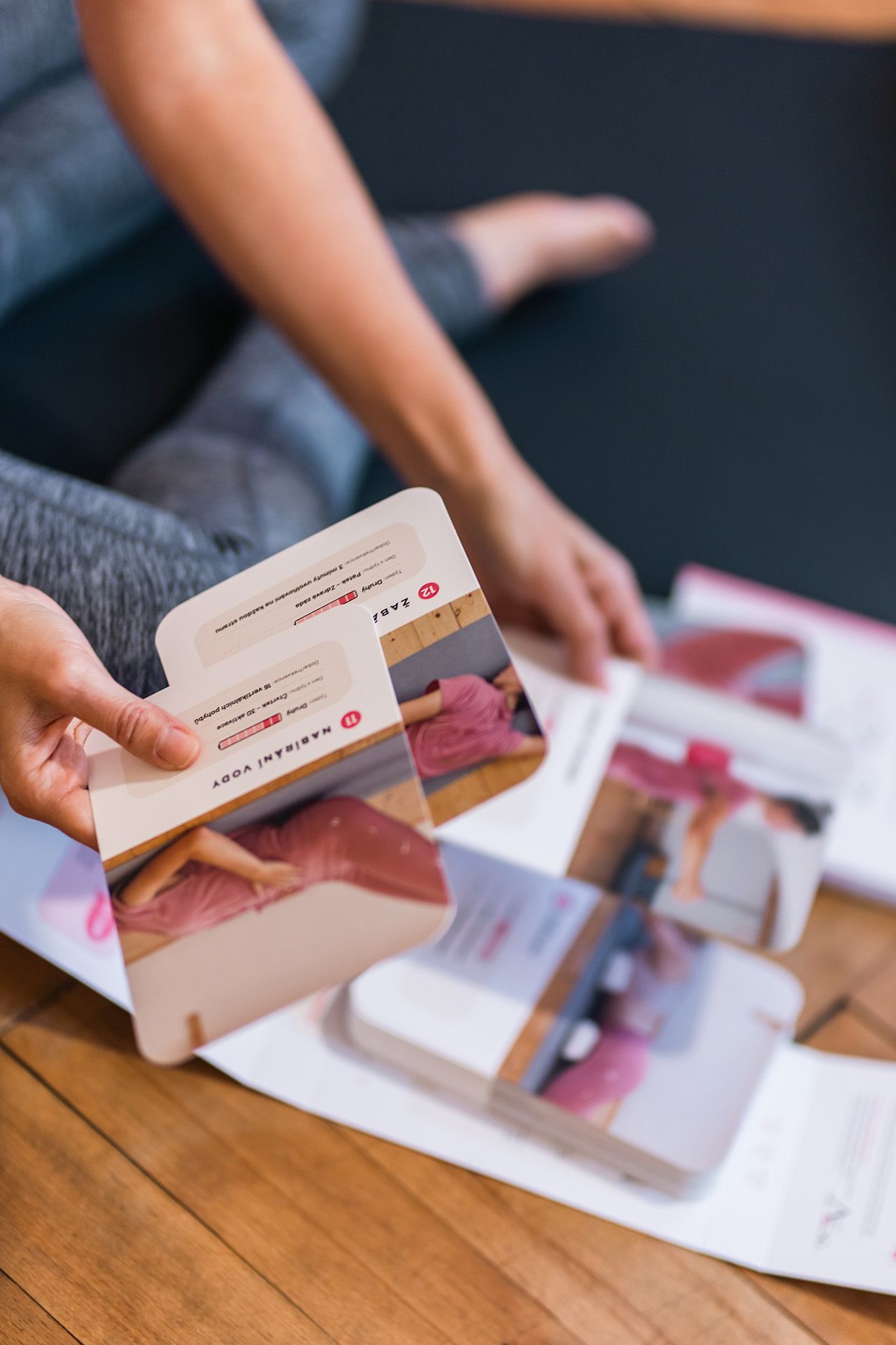
A single logo enables quick brand recognition across all outputs — from exercise cards for children to workbooks for women, leaflets and other accompanying materials. It is also a registered trademark, CoreYoga®, because a methodology this well developed — along with its visual system — requires a clear and legally protected identity. This allows the brand to grow safely and expand into new projects and exercise tools.


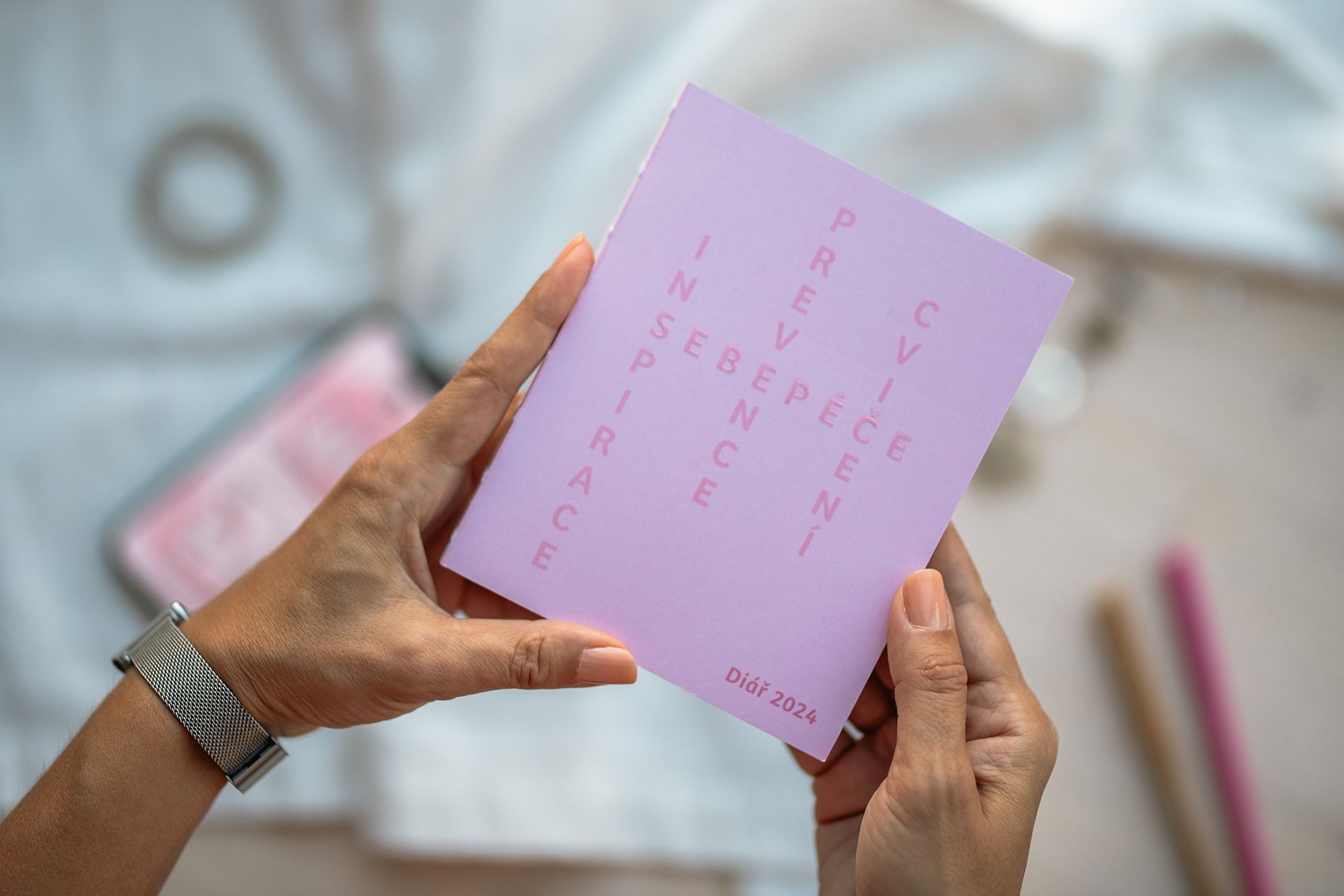
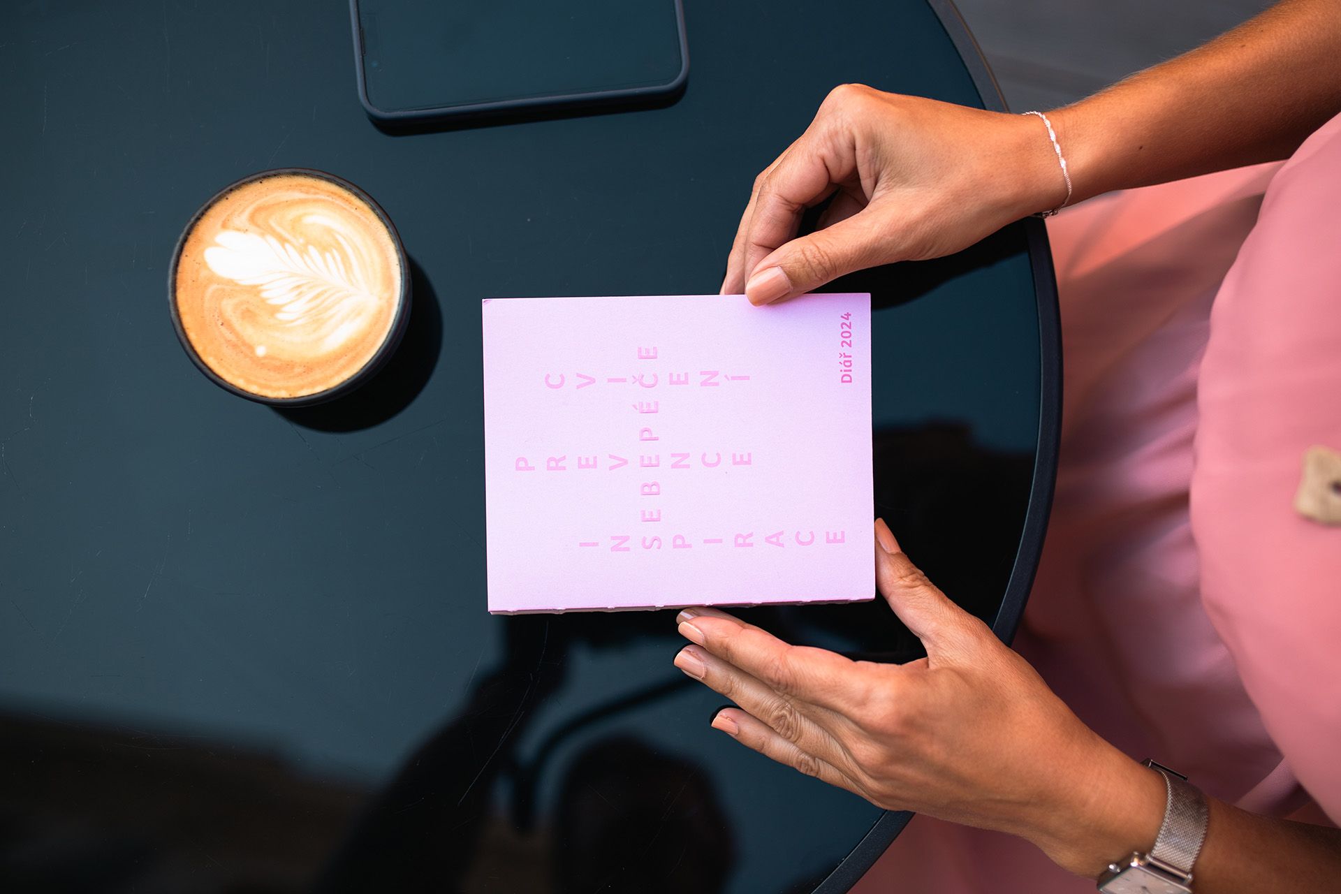
The visual language is built on clarity and simplicity, whilst leaving room for the energy and lightness that are characteristic of the CoreYoga method. The whole is unified, accessible and supportive — designed to grow steadily over the long term.

Darina Fiala — logo, graphic design of printed materials

Adéla Friesová — product photography

Exercise Cards & Prehistoric Game for Children

Children's Foot Exercise Cards

Photo © Adéla Friesová

A single logo can be enough for a business that spans a wide range of projects and categories. It adapts flexibly to different forms of communication and makes the brand easy to remember.

Got a great project that's missing a face or a strategy? We're here for you.

More Projects

Avantgard

Craftsmanship called for an identity to match. The rebranding brought a confident face and a clear point of view.
View Project