Bezobalka

logo, redesign, corporate identity, illustrations

Bezobalka is a zero-waste shop that brings sustainability into everyday shopping. The aim of the redesign was to create a brand that feels open, clear and naturally close to people of all generations.

Client:

Kamila Skalecká, Katka Boraňová

Timeline:

2023–24

About the Project

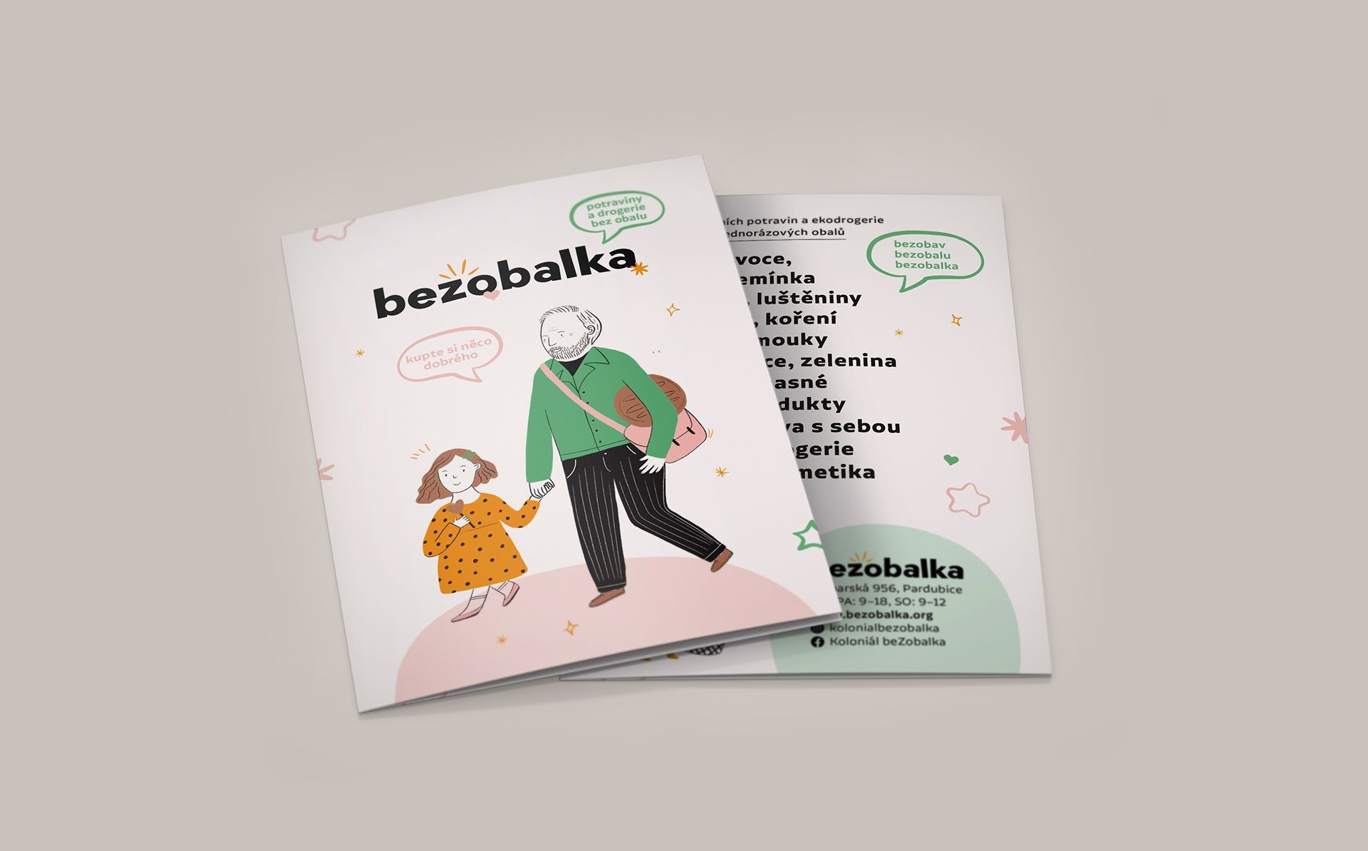
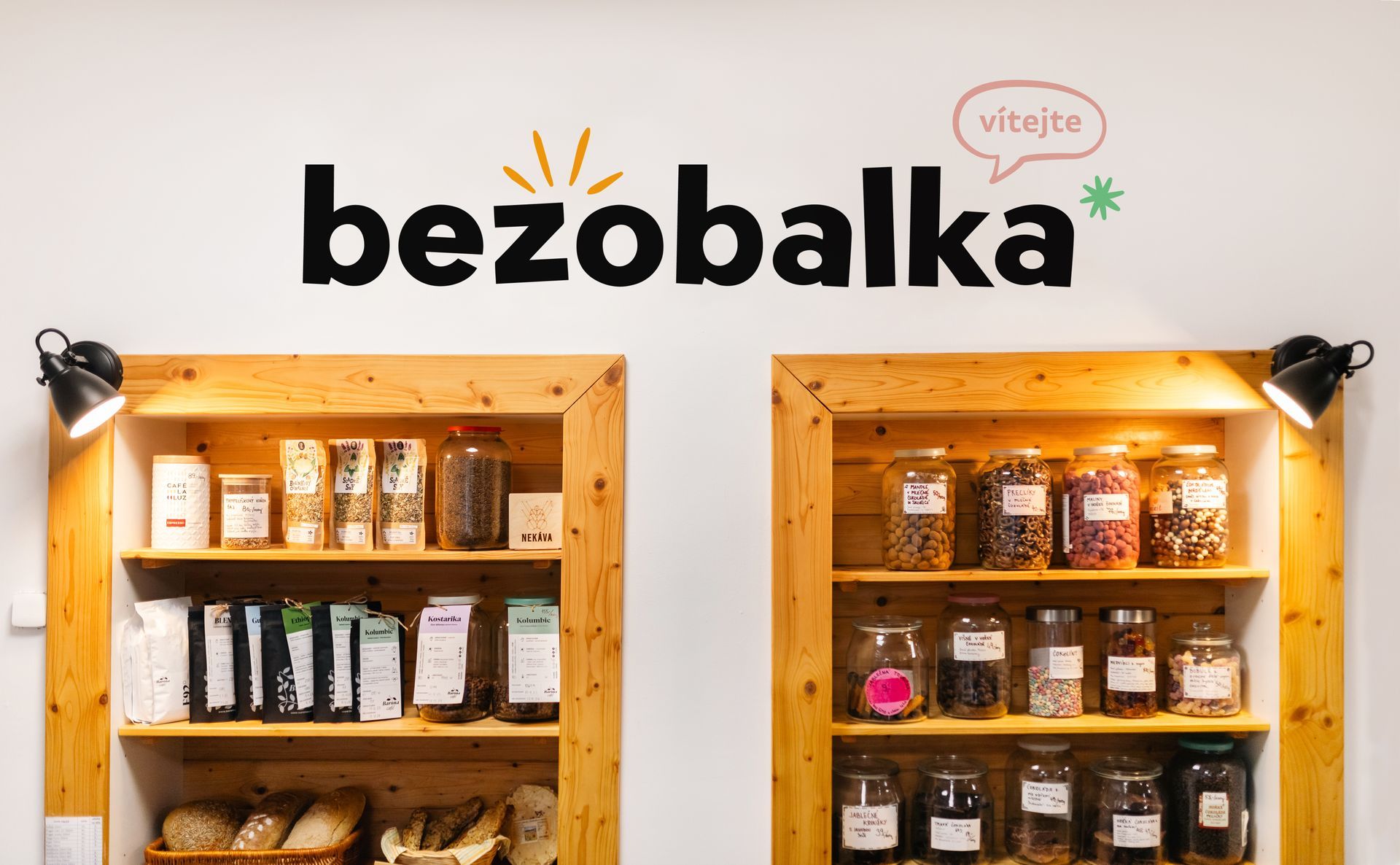
The shop's owners wanted a visual identity that clearly communicates the brand's values — simplicity, accessibility and closeness to people and their everyday choices. It was important that the visual style would flow seamlessly from graphics into the physical space, and encourage visits from people across all generations.


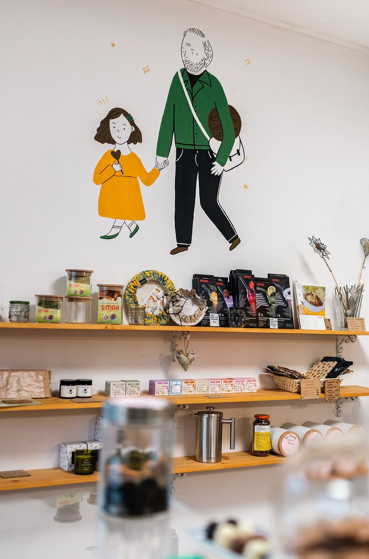
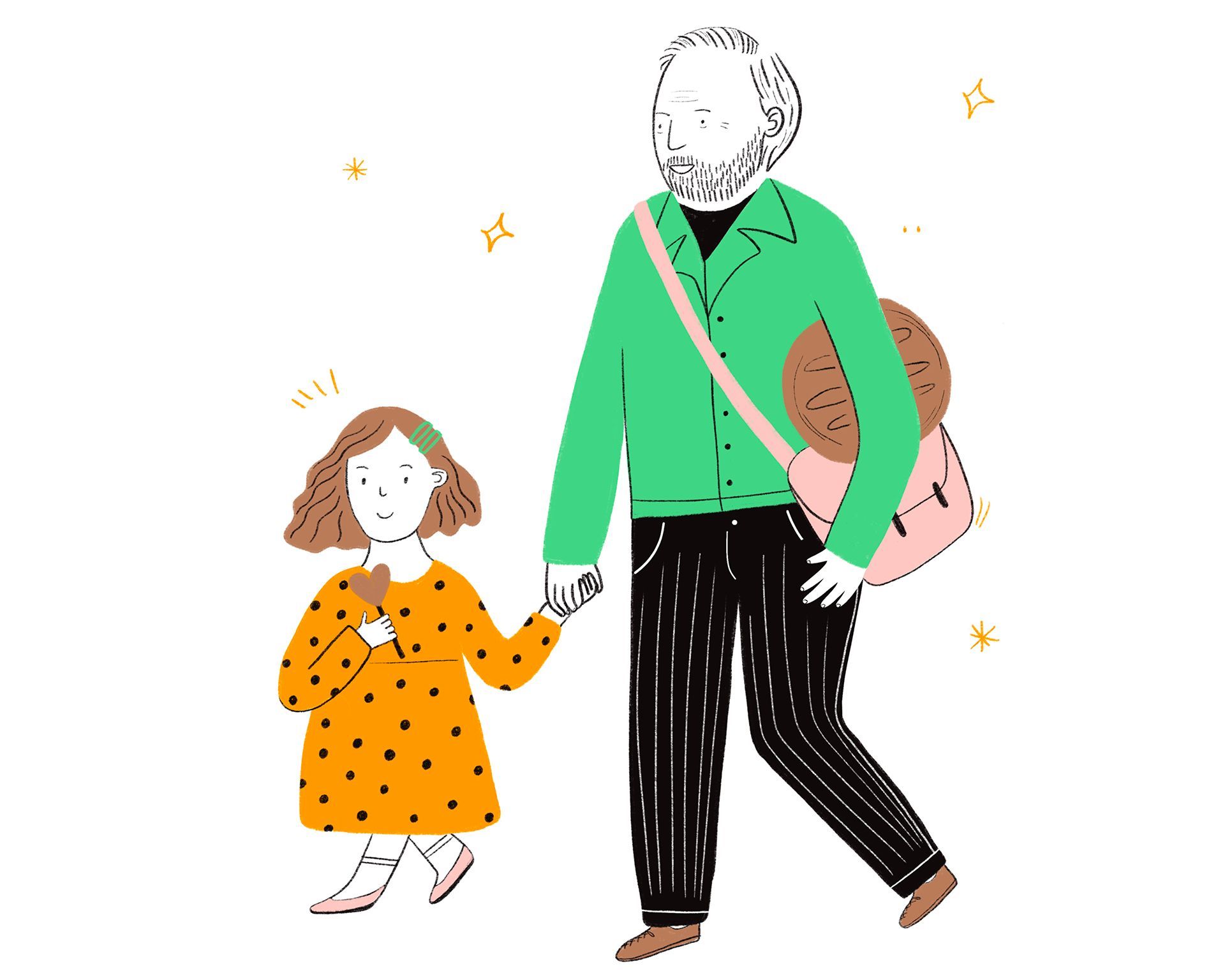
The visual language is rooted in simplicity, illustration and everyday stories. Figures of ordinary people — a grandfather with his granddaughter, a skateboarder doing the shopping, a pregnant woman with a bag — appear in the graphics, in the space and in the digital environment. The clean interior allows the illustrations on the walls to stand out, giving the place a sense of life and naturalness.

The graphics and the space together create a unified experience that supports mindful, low-waste shopping. Bezobalka is not just a shop — it is a place where sustainability meets humanity, and somewhere people are happy to return to.

Darina Fiala — visual identity concept and design

Natálie Březinová — illustration

Adéla Friesová — photography

Barbora Fryčová — web design

Lighter and more open, the shop feels clear and uncluttered — naturally inviting people in. The visual elements can now truly shine, creating a welcoming, accessible and human environment for all generations.

Inspired by this brand transformation?

More Projects

Avantgard

Craftsmanship called for an identity to match. The rebranding brought a confident face and a clear point of view.
View Project