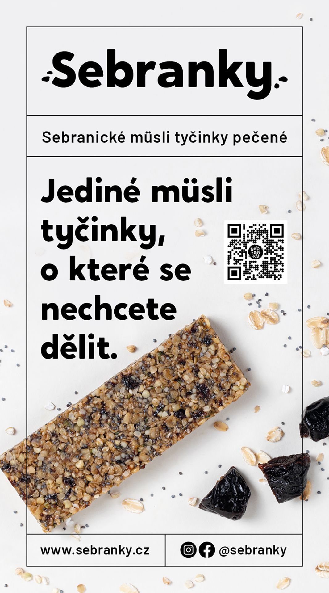
Sebranky
logo, redesign, corporate identity, strategy, photography, print, social media assets
Client:
Jana Dvořáková
Timeline:
2021–24
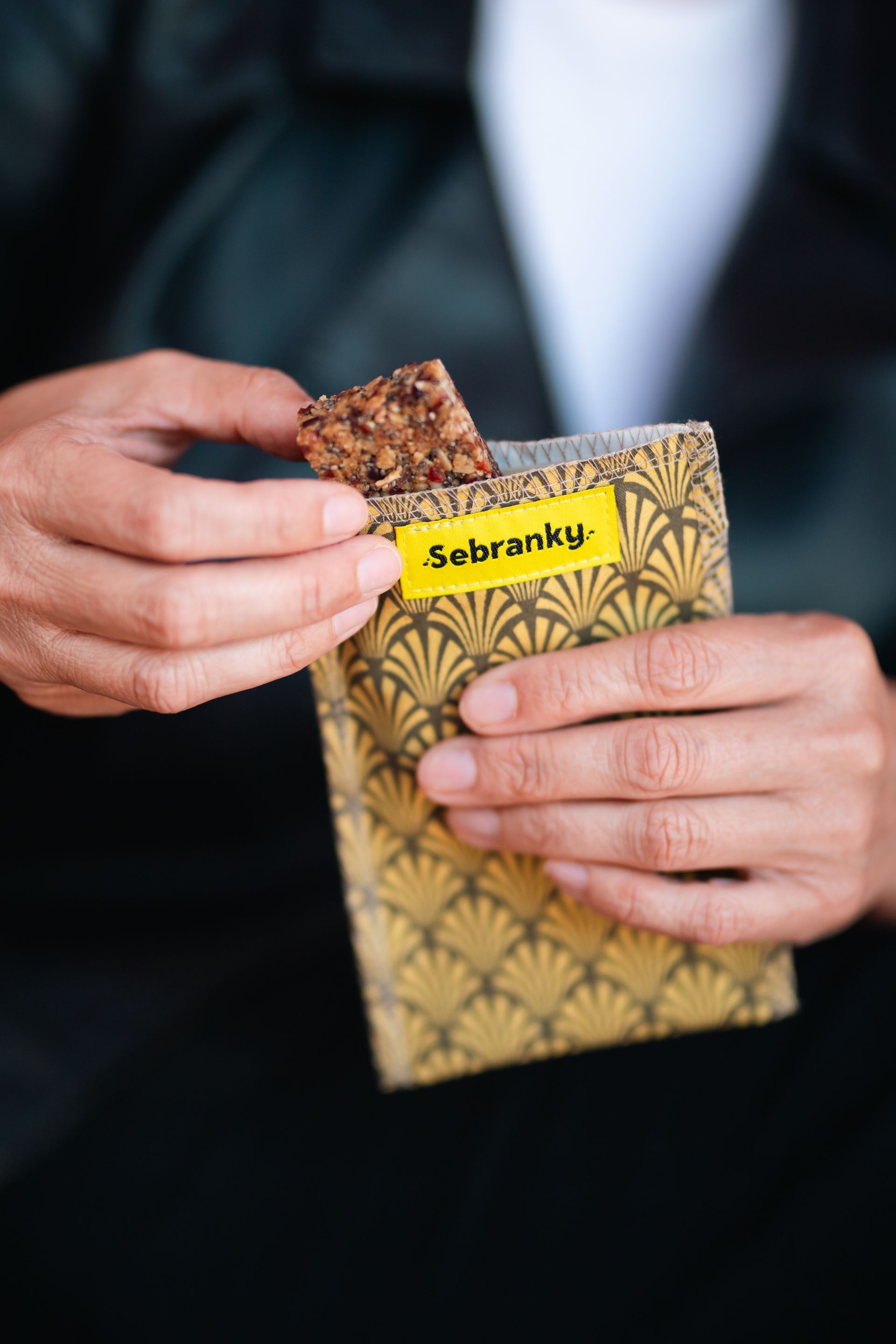
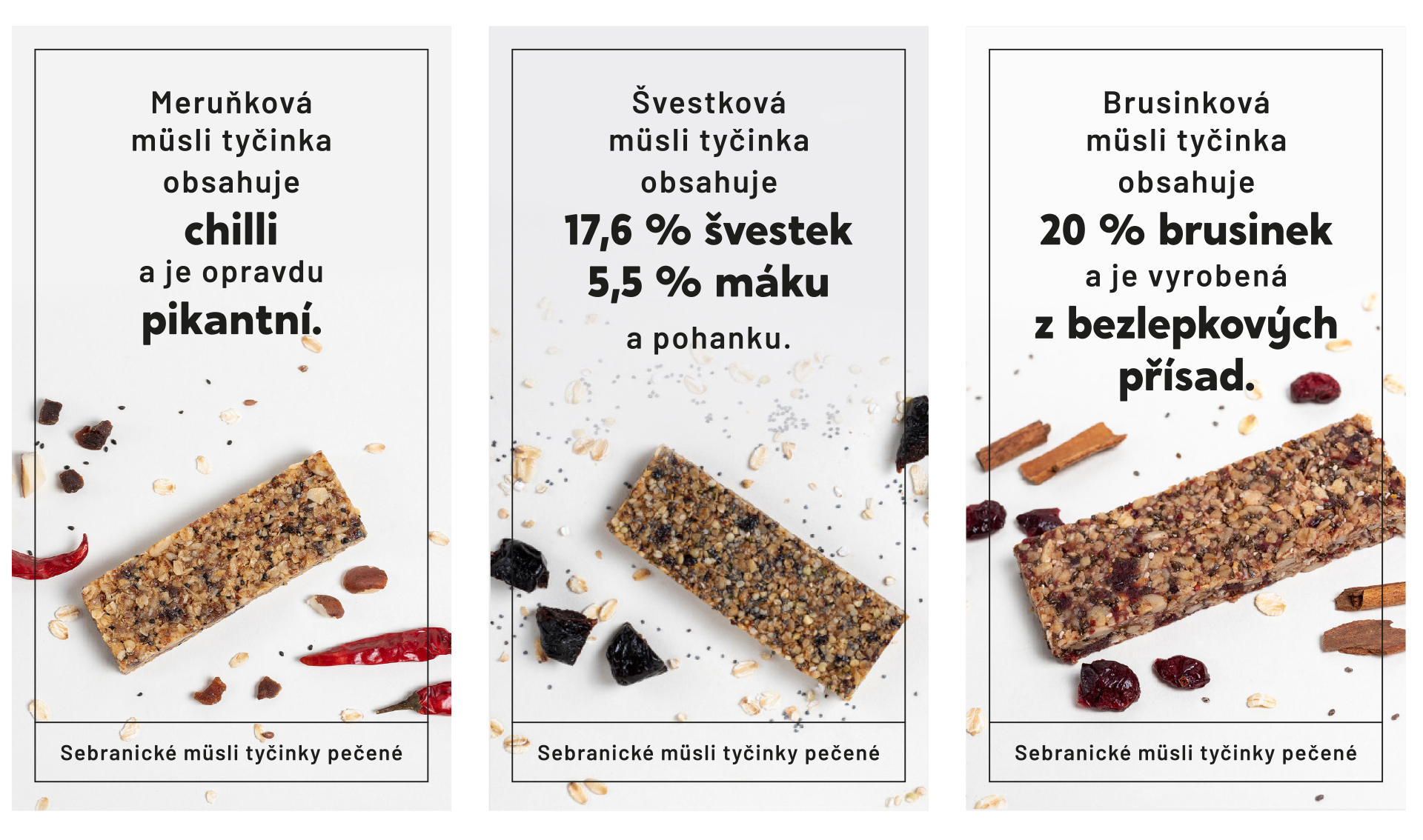
Sebranky are baked granola bars from Sebranice, made from honest ingredients and unusual flavour combinations — such as apricot with chilli or coffee with goji. They are produced locally, in small batches, with an emphasis on quality, flavour and the joy of eating. They are made for everyday snacking and as a small gift — with a coffee, on the go, or in place of dessert.
About the Project
The owner of Sebranky wanted a brand that would reflect the quality of the product, its local values and a contemporary character. The original logo felt old-fashioned, lacking personality and clear communication. A new brand was built on a clear strategy and a defined purpose — to improve people's everyday lives by giving them a healthy, surprisingly tasty snack. The project also included photography and the development of a tone of voice that helped the brand connect better with its audience. The aim was to reach in particular young people who care about healthy eating and buy products for themselves and their children.
The redesign brought clarity, energy and structure. The brand gained an expression that matches its values — simplicity, locality and sustainability. The new visual style unified all outputs and gave Sebranky a light, playful and contemporary character. Today the brand feels fresh, authentic and communicates clearly, with respect for both nature and people.
Darina Fiala — design, brand concept and strategy, photography concept
Žaneta Vajdová — marketing strategy
Adéla Friesová — product and lifestyle photography

Idea
The visual identity draws on the motif of "gathered pieces" of ingredients, celebrating the brand's playful spirit. The choice of ingredients is far from random — each combination is carefully tested, unconventional and perfectly balanced. And of course, they come from Sebranice!
The bars themselves invite you to taste them, give them as a gift or enjoy them with a coffee instead of cake. They come in recyclable boxes of ten, and for trips and adventures, a fabric pouch is included.

Even small granola bars can be extraordinary. The visual identity brings freshness, a clear character and a playfulness that reflects the carefully chosen flavour combinations. It supports natural communication with the audience and stands out both in packaging and product presentation.
Like the look of this brand?
More Projects
Avantgard

Transitions