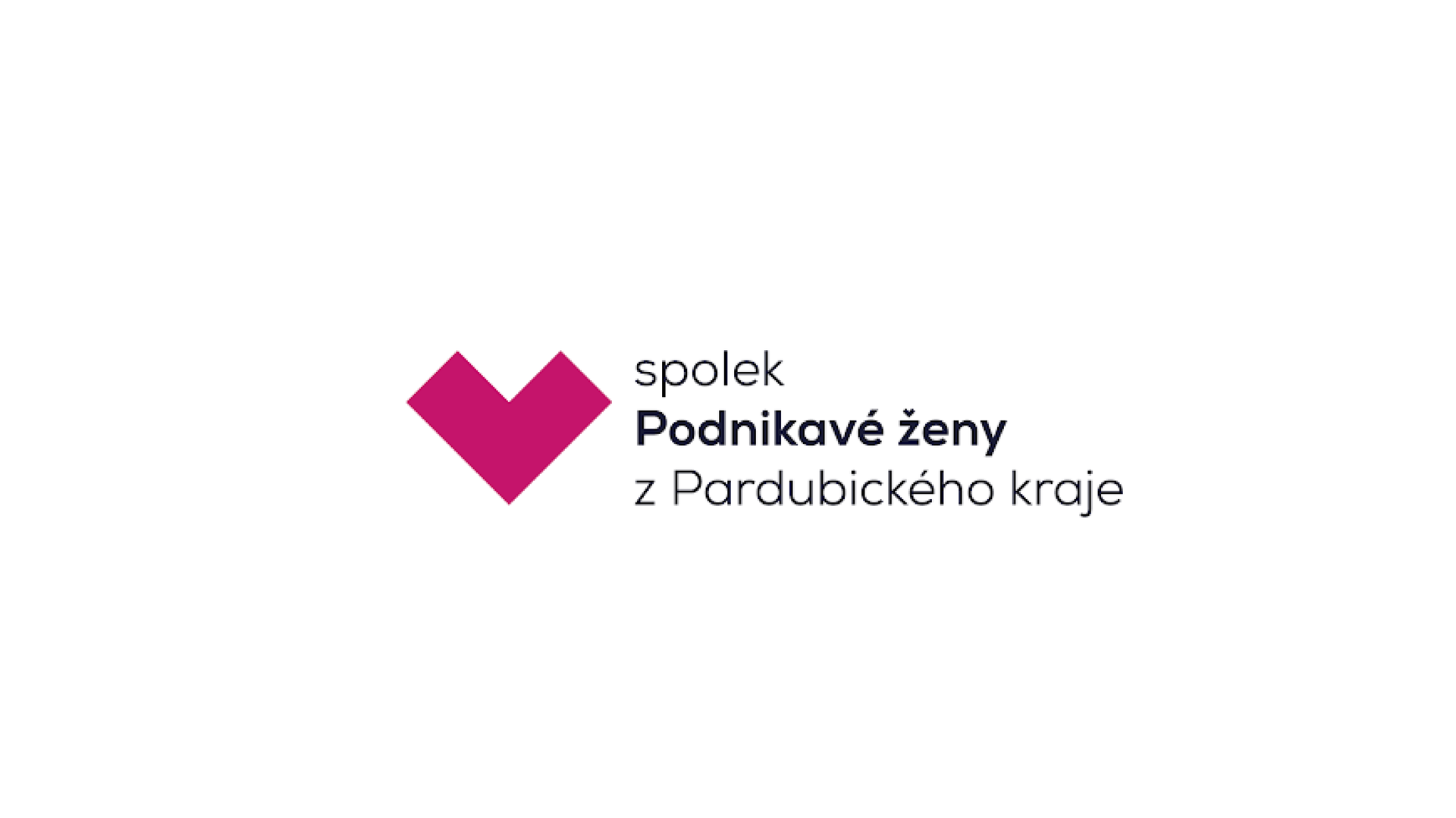
The aim of the redesign was to unify the visual style, give the brand a more professional yet still human expression, and create a logo that is original and easily recognisable — the original symbol was too easily confused with others.
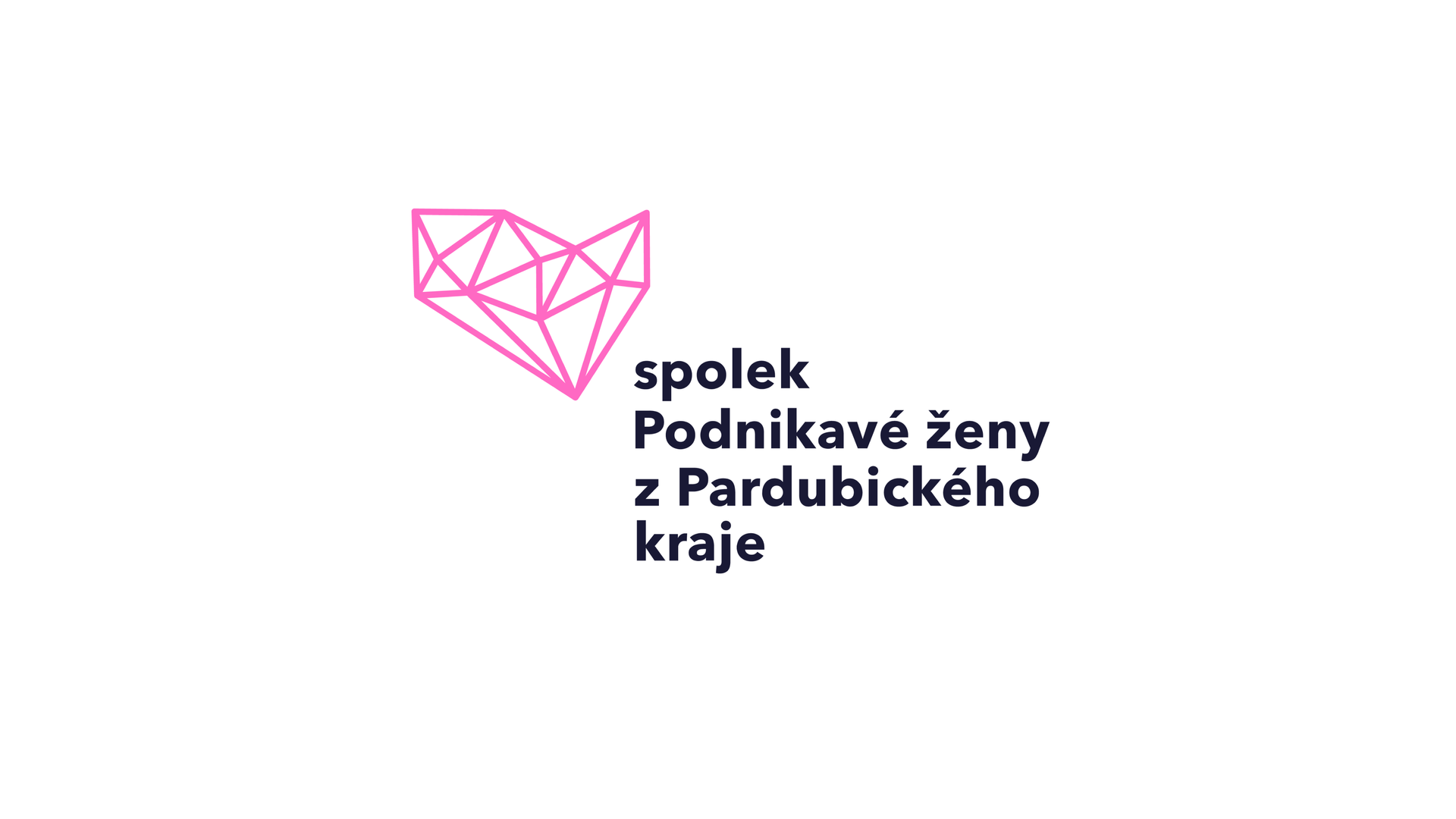
The new logo brings together several symbols — a heart, an arrow, a gemstone and the outline of the Pardubice Region — subtly expressing energy, direction and connection.
The colour palette is built on a contrast between feminine pink and deep navy blue. The pink brings warmth, openness and care, whilst the navy adds stability, trustworthiness and depth. Together they create a balanced whole that feels approachable yet confident.
The visual identity builds trust, fosters a sense of belonging and feels consistent across all channels and community activities.