Avantgard

identity, rebranding, print, photography

Avantgard is a Czech brand of men's accessories — ties, shirts and braces — built on craftsmanship, attention to detail and a contemporary approach to style. Rooted in Pardubice, the brand has long been building a position for men who want to feel naturally confident, not only on formal occasions.

Client:

Ivana Beránková, V.style CZ s.r.o.

Timeline:

2022–2025

About the Project

The rebranding of the visual identity deliberately moved the brand forward. The original logotype lacked a symbol and remained within the expected conventions of the sector. The new solution set itself apart from the visual clichés of the industry — motifs of ties, shirts and heraldry. The aeroplane symbol with an integrated letter A brings a different dimension: ambition, lightness and direction. It references pilots as icons of style, and aviation, which is a natural part of Pardubice — the city where the brand was born.

The motif works both as a bold emblem and as a subtle detail. It appears on cufflinks, badges and fabric prints. It gives the product character without drawing attention to itself. Just like the man who wears it.


The new photography reinforces this philosophy. It doesn't rely on heavy styling, but on an atmosphere of natural confidence. The brand's aesthetic feels contemporary, masculine and assured. It gives Avantgard a clear and distinctive face — and gives men the feeling that they can stand out while still remaining themselves.

Darina Fiala & Barbora Fryčová — concept and identity design

Adéla Friesová — product photography

Idea

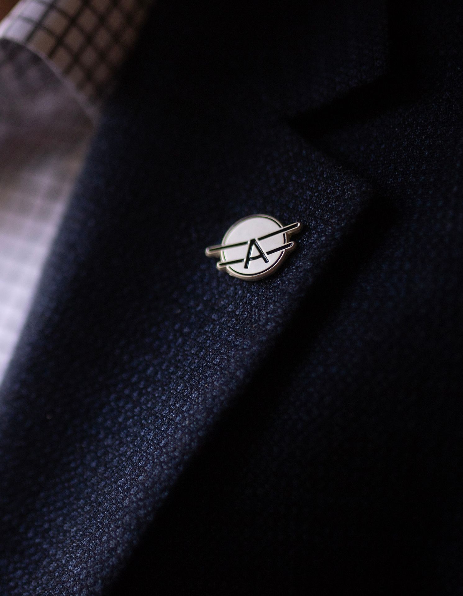
Stand out. Aim higher. This is not just a tagline — it's an attitude. The feeling of dressing in a way that lets a man remain himself while stepping out of the crowd. Not ostentatiously, not obviously, but with ease and confidence.


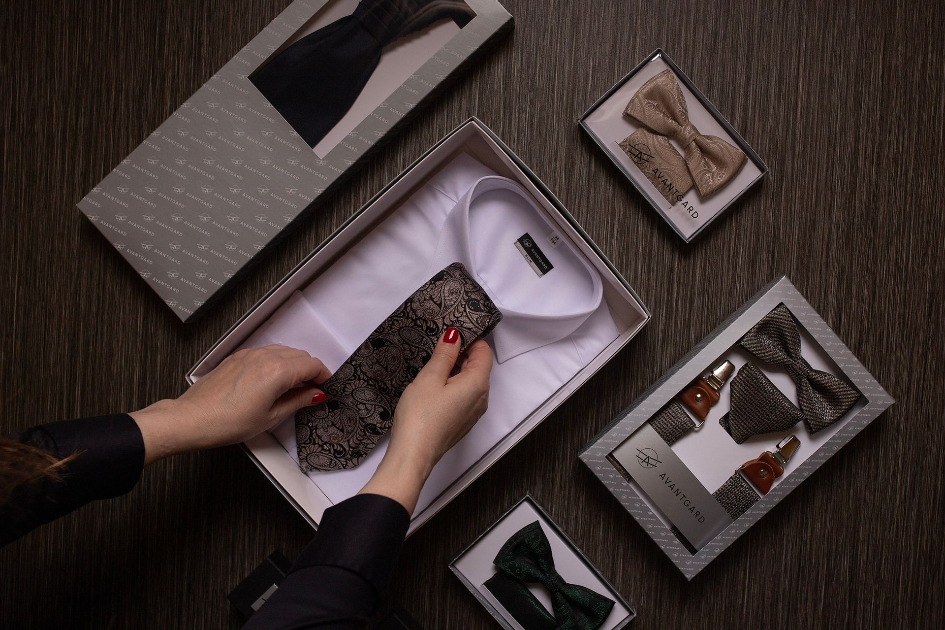
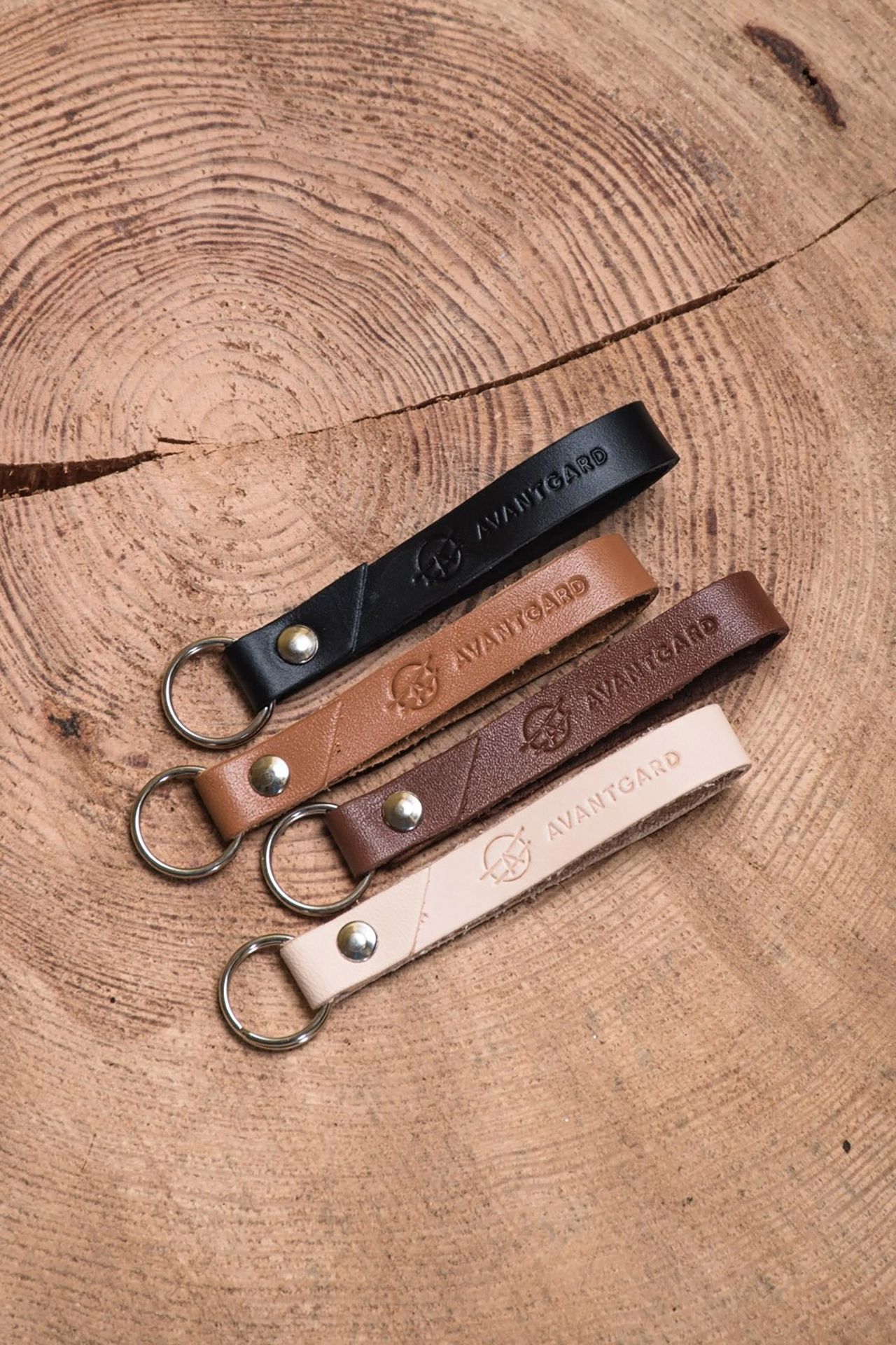
The philosophy of Avantgard is rooted in the belief that quality clothing and accessories don't belong only to formal occasions or strict business dress codes. They belong to everyday life, to a relaxed style, to moments when a man wants to feel naturally self-assured. It makes no difference whether he chooses the accessory himself, or whether it's chosen by a woman who knows exactly how she wants him to look beside her — confident, well-dressed, with an effortless charm.

A brand for men gained a bold, confident and distinctive character. The symbol and visual language convey a sense of "taking flight" — helping men look sharp and feel assured.

Got a great project that's missing a face or a strategy? We're here for you.

More Projects

Avantgard

Craftsmanship called for an identity to match. The rebranding brought a confident face and a clear point of view.
View Project