Harmonie Bachovek
logo, packaging design, illustrations
Bach flower essences work with subtle emotions, inner balance and personal attunement. They are not about quick fixes, but about awareness, stillness and harmony. These values became the starting point for creating the visual identity of the Harmonie Bachovek brand.
Client:
Klára Libertová
Timeline:
2023
About the Project
The identity is built on gentleness and calm, in keeping with the character of the Bach essences. The aim was to create a visual language that does not overpower, but naturally accompanies — without unnecessary decoration, with an emphasis on atmosphere, sensitivity and the coherence of the whole. Gentleness and stillness form the underlying tone of the entire visual concept.
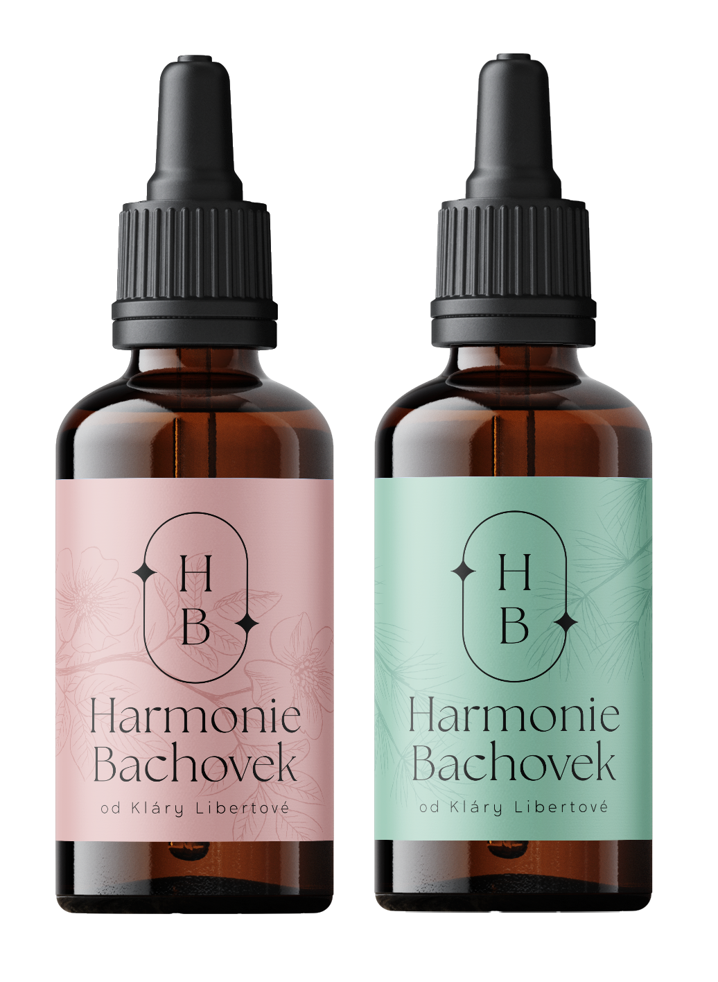
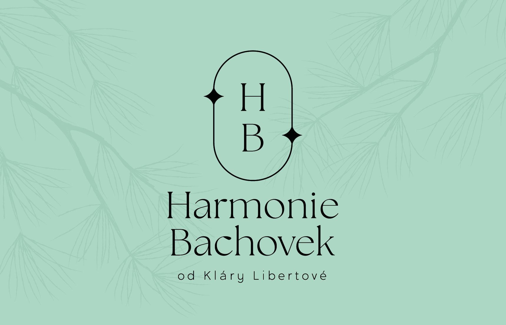
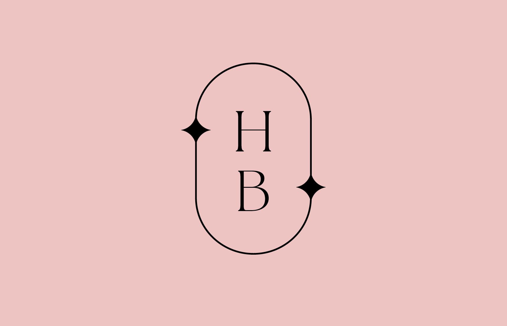
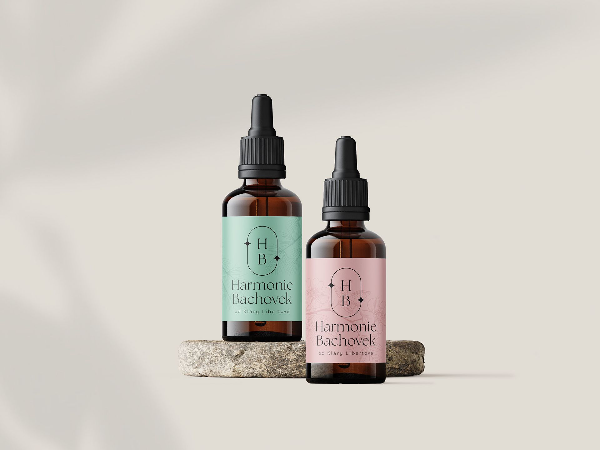
The logo is derived from an ellipse — a symbol of flow, continuity and wholeness. Two small stars are placed along its curve, evoking purity. They bring to the brand a quiet search for balance between the inner and outer world, between emotion and calm. This detail gives the logo its distinctive character without disturbing its overall delicacy.
The identity of Harmonie Bachovek remains in quiet harmony with the gentleness of the essences themselves. It does not overpower their effect, but sensitively accompanies it — allowing the calm, balance and inner attunement they carry to come through.
Darina Fiala — concept and identity design
Hana Krauseová — illustration
Calm and the search for balance. An identity as a quiet companion for the gentle work of essences.
Got a great project that's missing a face or a strategy? We're here for you.
More Projects