Nadace Partnerství

rebranding, visual style, print, social media assets

Nadace Partnerství is the Czech Republic's largest environmental foundation. Since its establishment in 1991, it has supported communities and individuals in caring for nature, the landscape and the quality of life in towns and villages. It provides grants, expert services and inspiration across a range of long-term programmes and projects, including the Tree of the Year initiative, the Living Soil programme and Adapterra.

Client:

Nadace Partnerství

Timeline:

Since 2022

About the Project

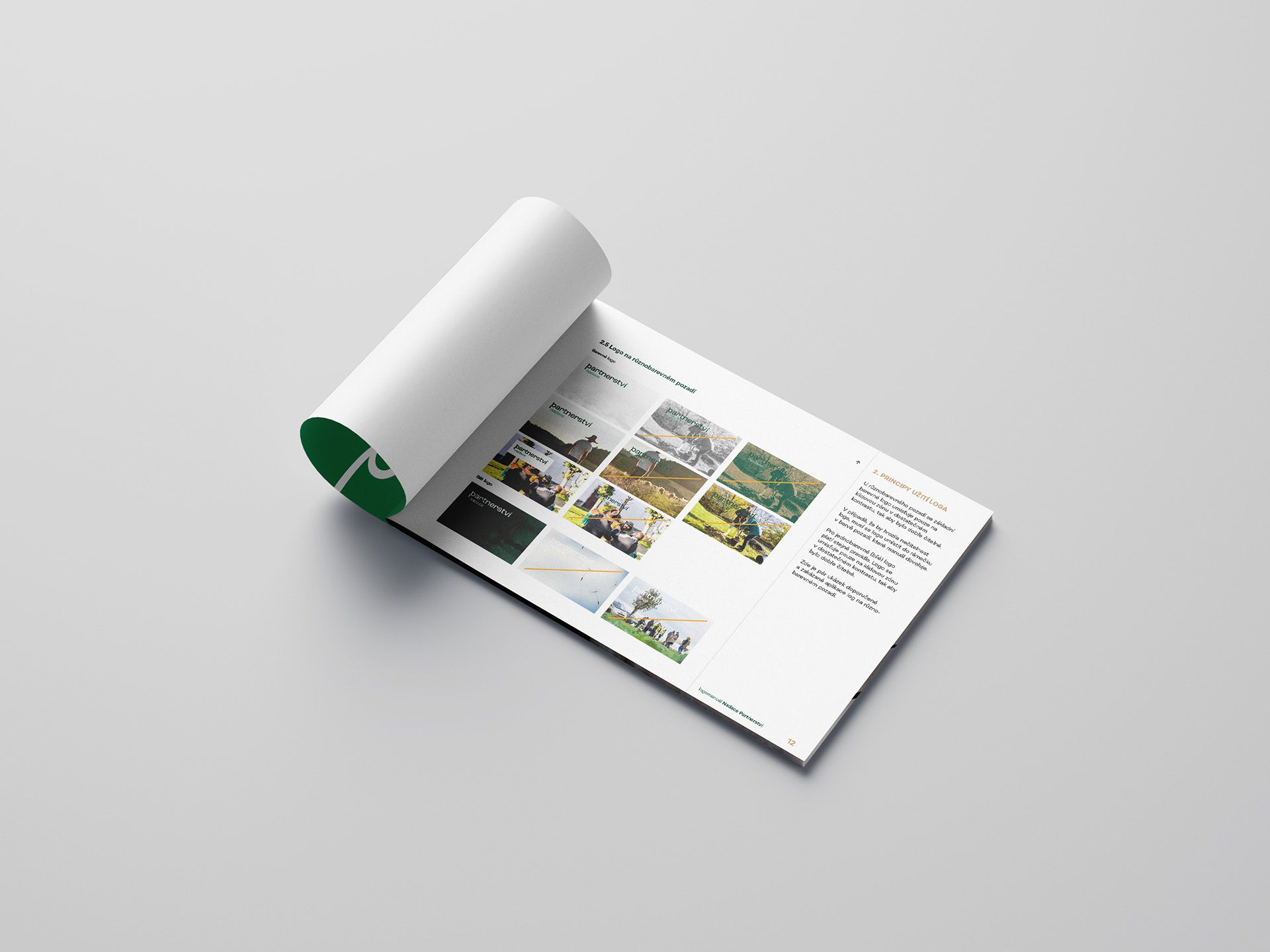
We were selected through a competitive tender to lead the rebranding of Nadace Partnerství's visual identity. We began with a thorough analysis of the existing brand, its core elements and its overall communications. The goal was not only to improve the legibility and functionality of the logo in modern digital formats, but also to create a system capable of reflecting the diversity of the foundation's projects whilst strengthening its perceived unity as a strong, long-established public brand.


Throughout the design process, we focused on developing what we call a "signature" — a flexible visual element that can connect with the foundation's various sub-systems whilst leaving a clear visual imprint of the main brand. The resulting dynamic line became the cornerstone of the identity, helping to better express the connections between the foundation's activities, its role and its values.

The project also included a typographic overhaul of the foundation's communications, grounded in modern principles of legibility and accessibility. A key decision was to separate the strapline from the logo itself, allowing the brand to feel stronger and more recognisable across all media — from the web and print through to outdoor formats.


The project as a whole strengthened Nadace Partnerství's position as a visible, consistent and trustworthy brand, able to communicate its message clearly and relevantly across a diverse range of activities and to varied target audiences.

Darina Fiala — design, strategy

Žaneta Vajdová — strategy

Jiří Beran (Sudetype) — typographic adaptation of the key symbol

Photo © Nadace Partnerství

A signature as a quiet endorsement — connecting projects, building trust and making it clear who stands behind them.

Inspired by this brand transformation?

More Projects

Avantgard

Craftsmanship called for an identity to match. The rebranding brought a confident face and a clear point of view.
View Project