Stilec & Partners
identity, print, interior design
ŠTILEC & PARTNERS is a law firm based in Prague. It focuses on comprehensive legal advisory services and places emphasis on expertise, precise work, and a partnership-based approach. Their communication is clear, structured, and professional — values that are also reflected in the visual identity and overall tone of the brand.
Client:
Štilec & Partners Law Firm, s.r.o.
Cooperation:
since 2017
About the project
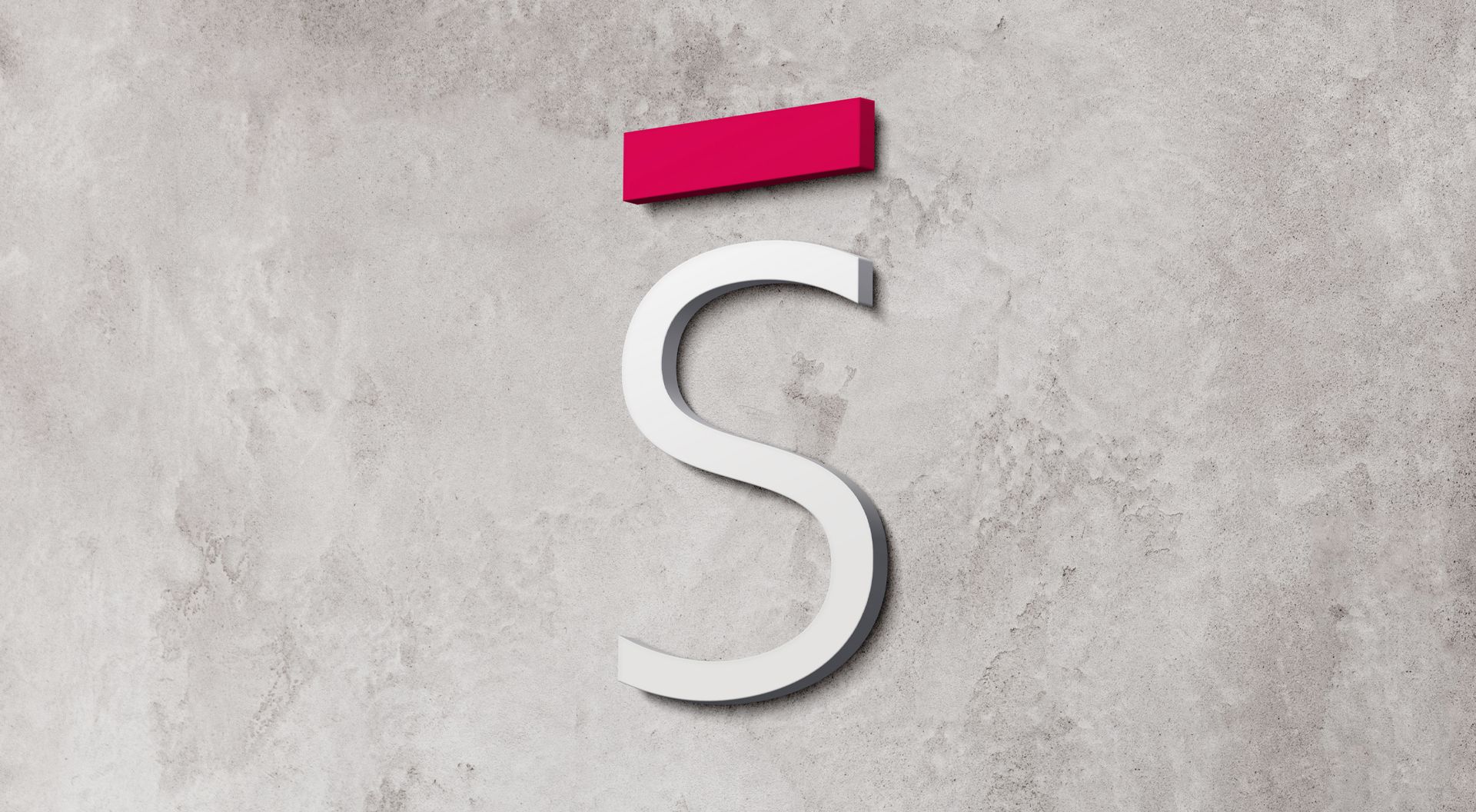
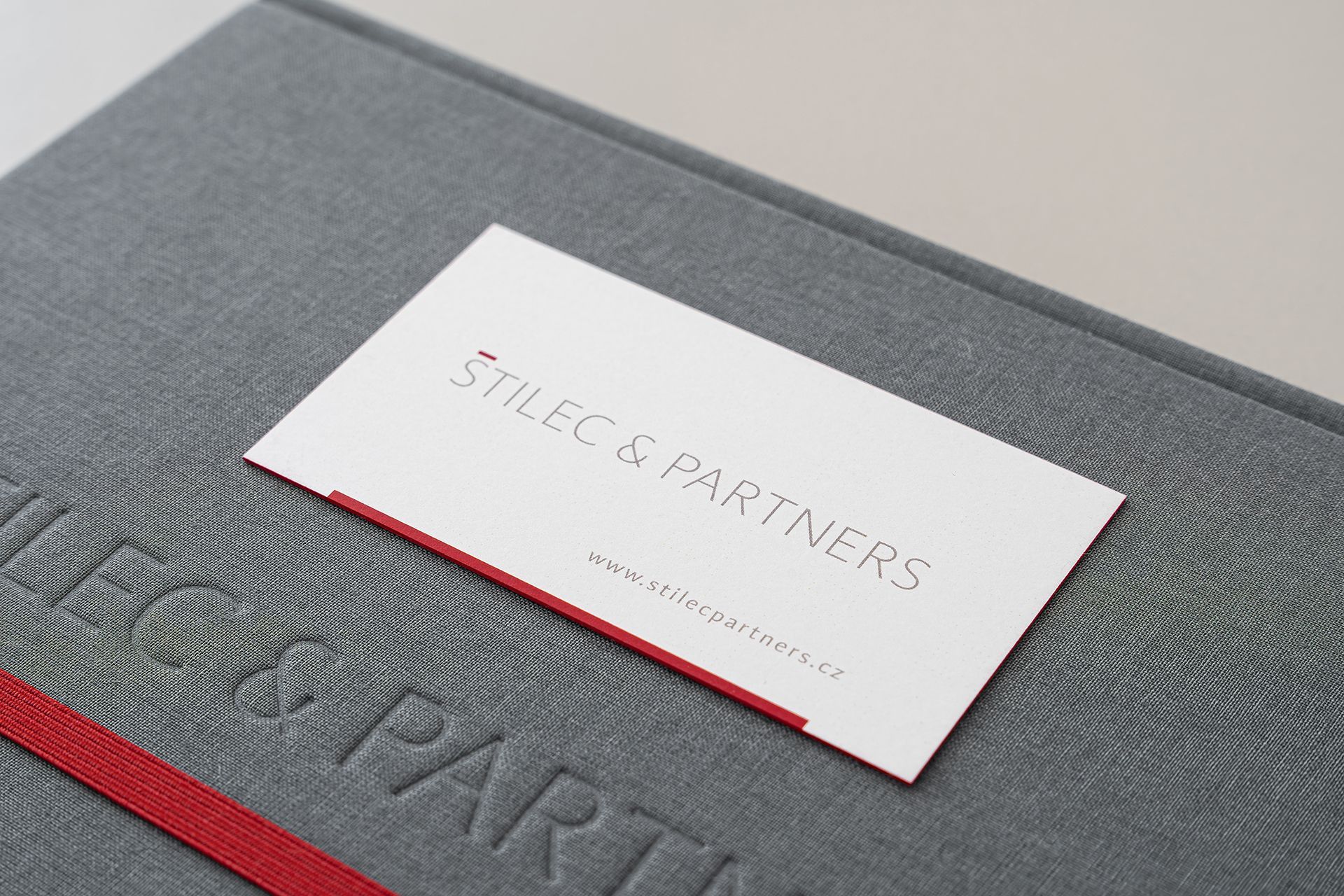
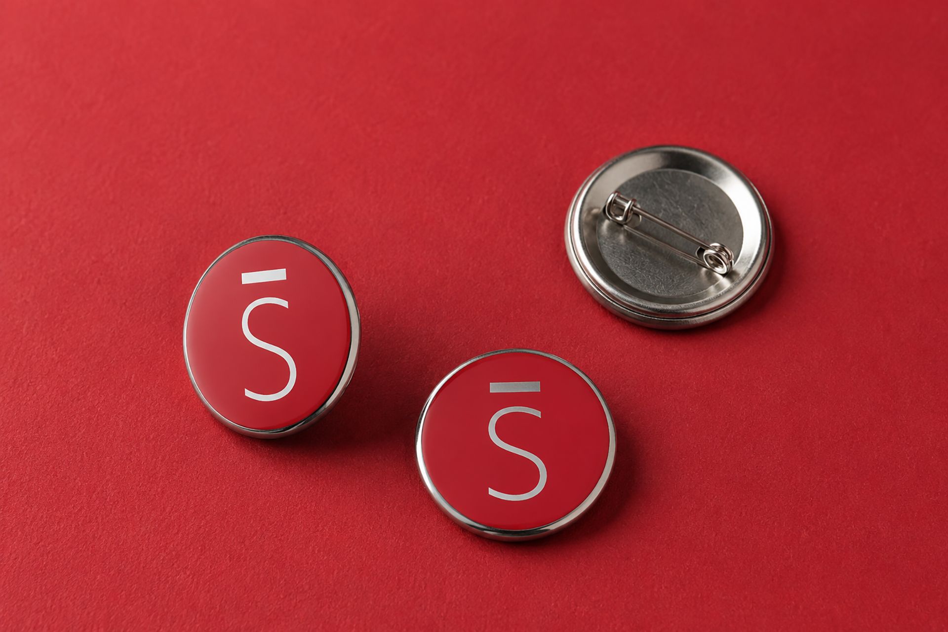
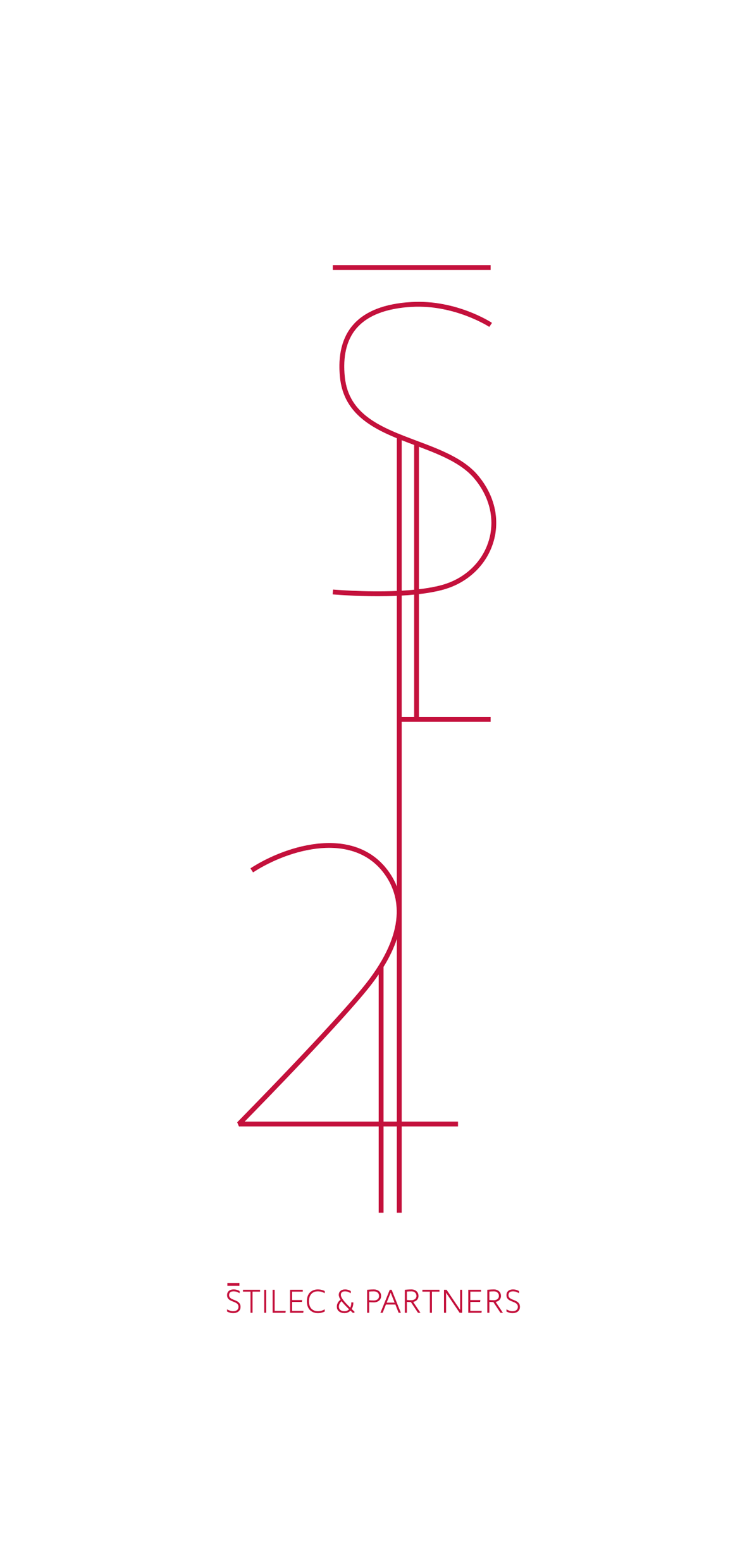
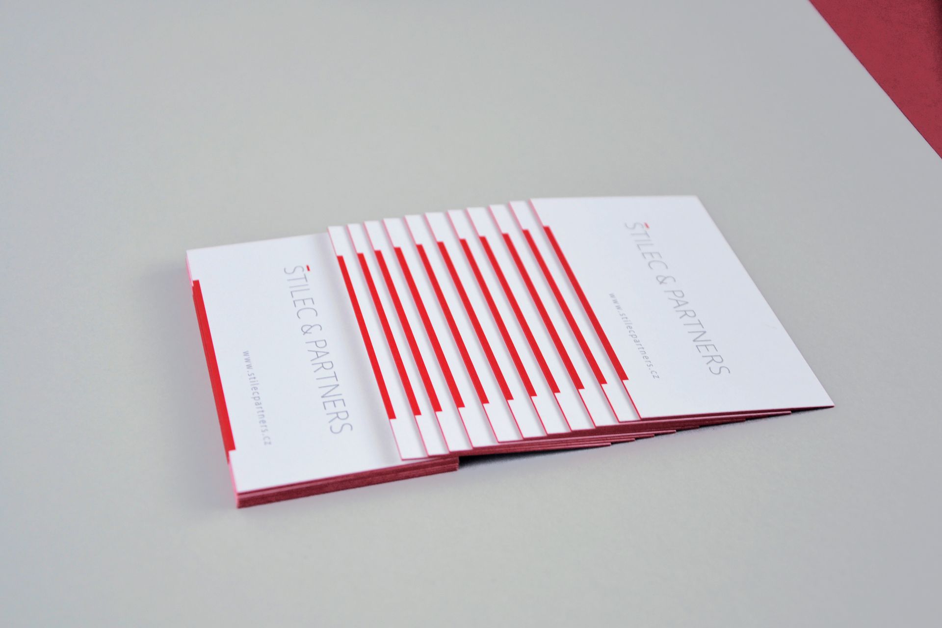
We designed a visual identity for the law firm that its founders could immediately identify with. At its core is a clean logotype, in which a red line replaces the caron over the "Š" in ŠTILEC. This subtle detail became the main recognizable element of the entire brand — one simple line that never feels dominant, yet gradually appears in different forms, from the logotype through printed materials to physical space.
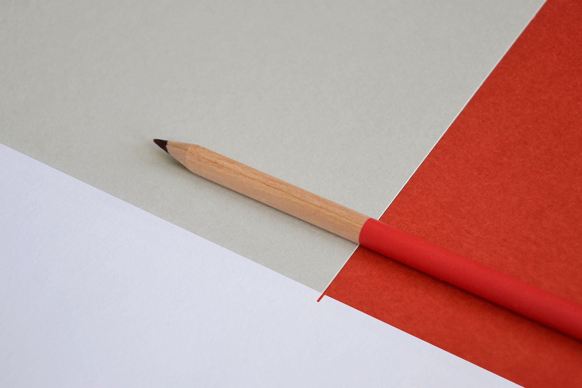
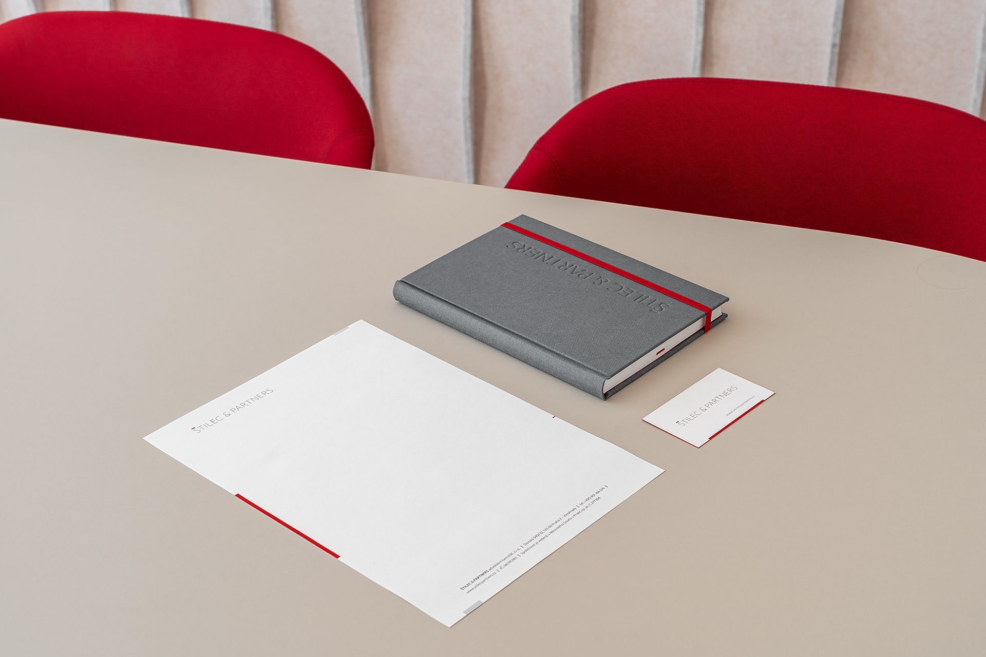
The color system is built on a combination of white, red, grey (concrete, bookbinding cloth, black-and-white photography), and a soft beige. The neutral tones are complemented by a bold red accent that gives the brand character and helps it stand out naturally.
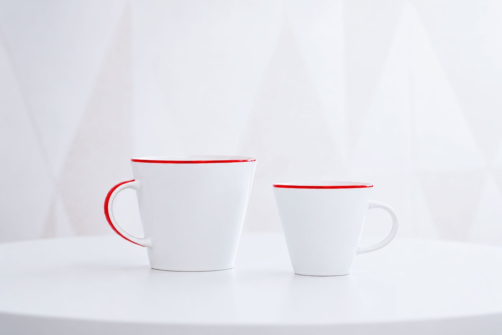
A well-designed visual system allows a brand to grow. The identity has gradually extended into small everyday details the firm uses daily — from office materials to white mugs with a delicate red rim, which the team now chooses on its own.
It is precisely in these details that the brand feels most natural. It's not about a large number of striking elements, but about a consistent principle that works across different situations and scales.
Darina Fiala – identity concept and design, 3D artwork design
Pavel Linhart – woodworking of the 3D artwork
H/M studio – interior design
Tomáš Kosek – interior photography
From graphics to space
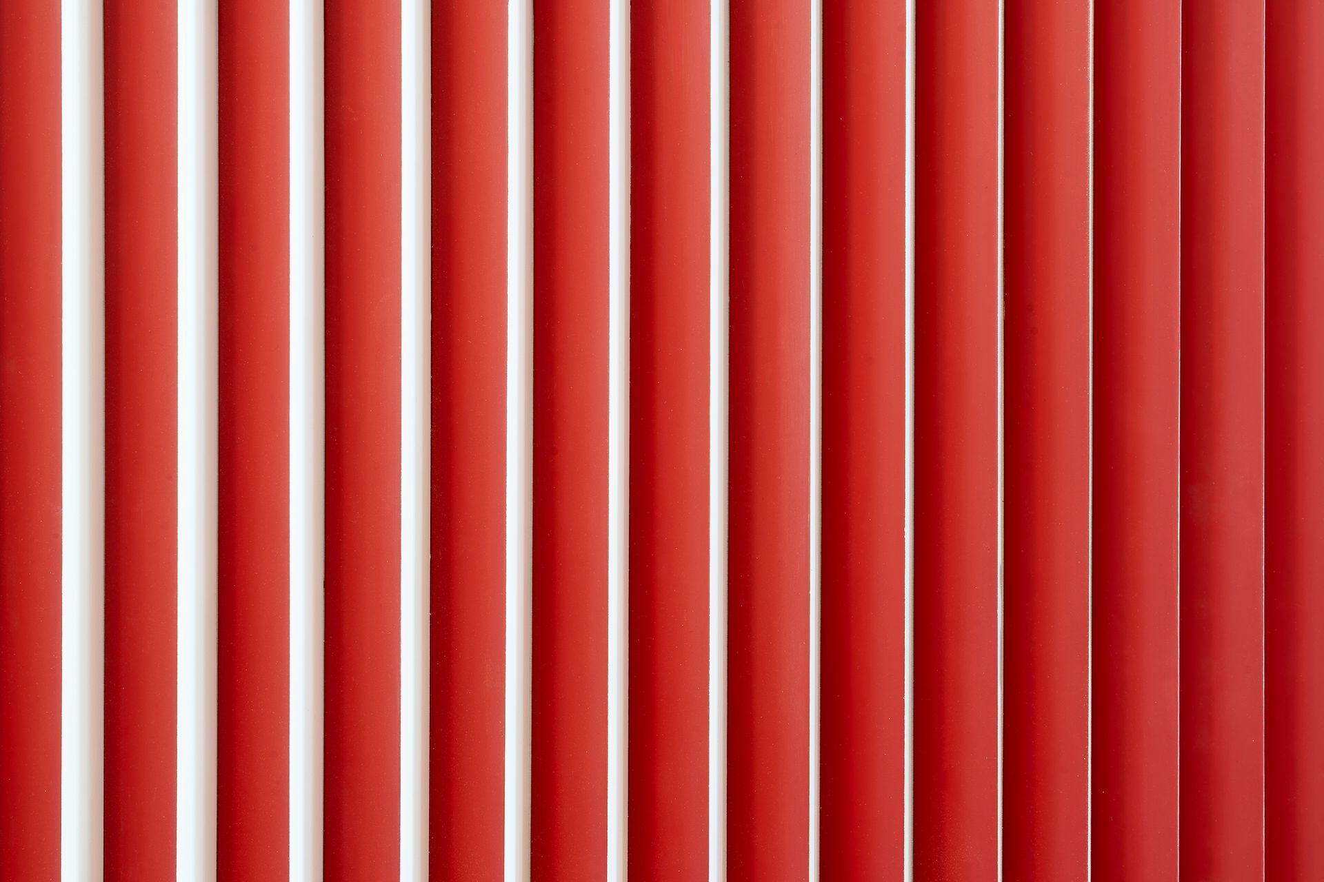
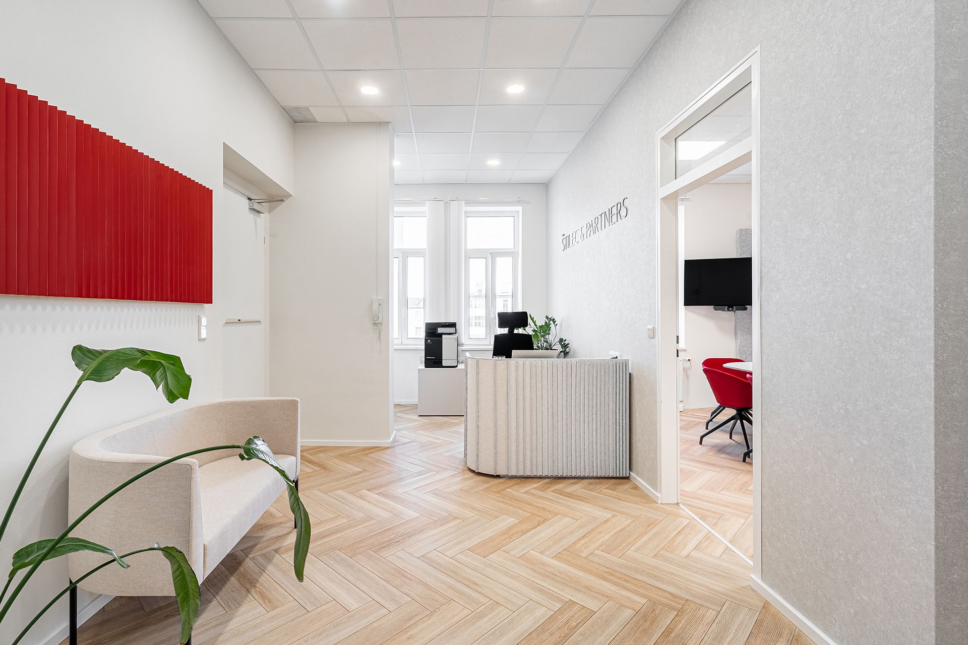
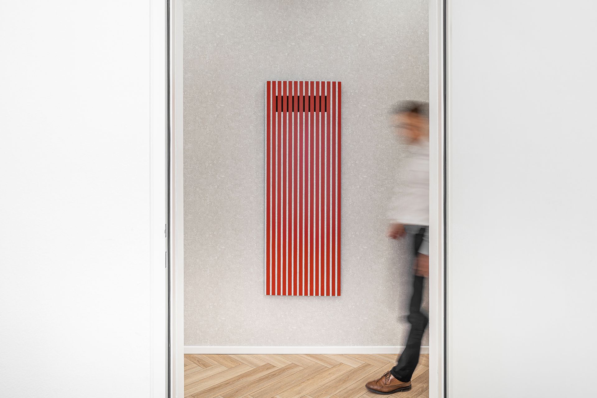
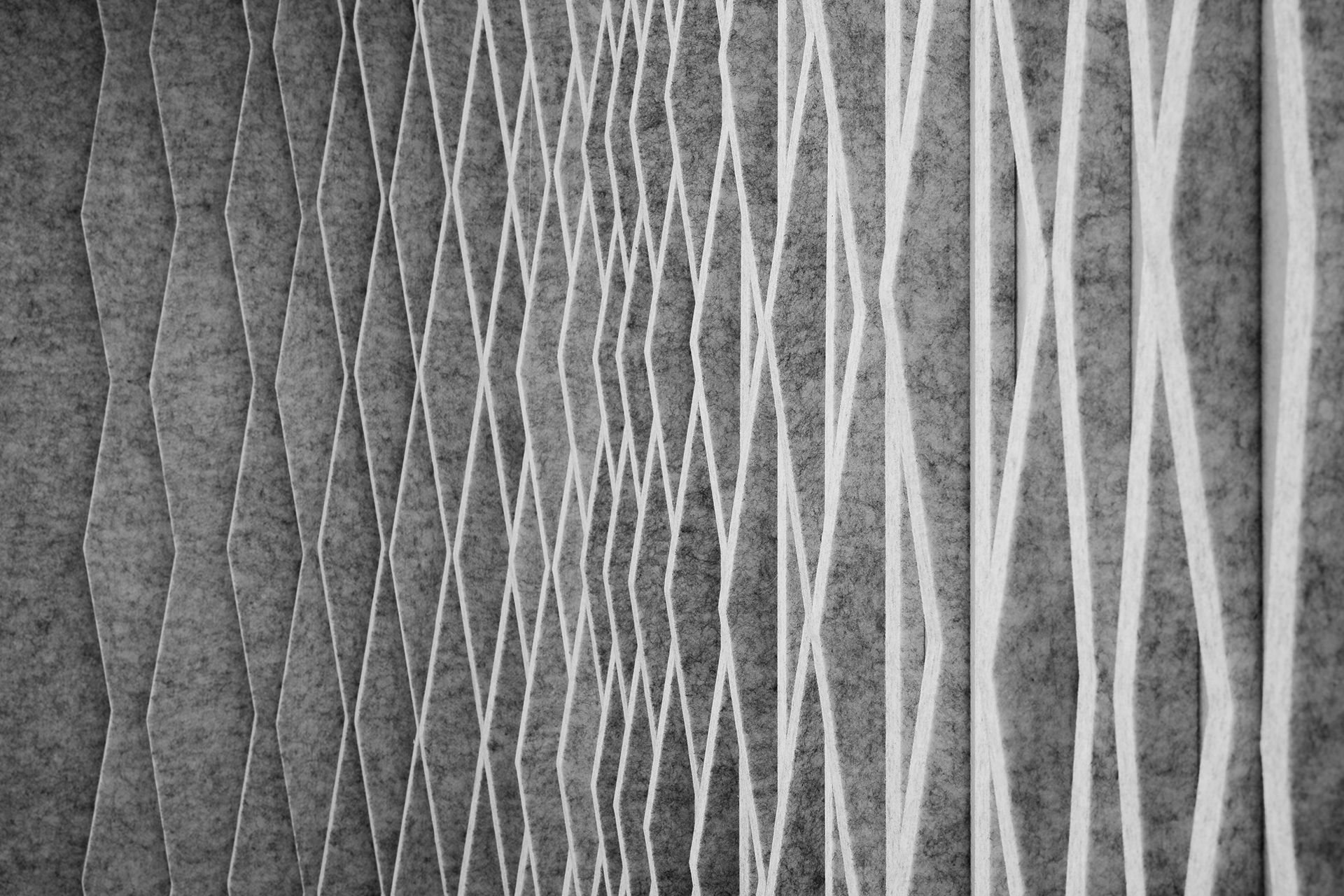
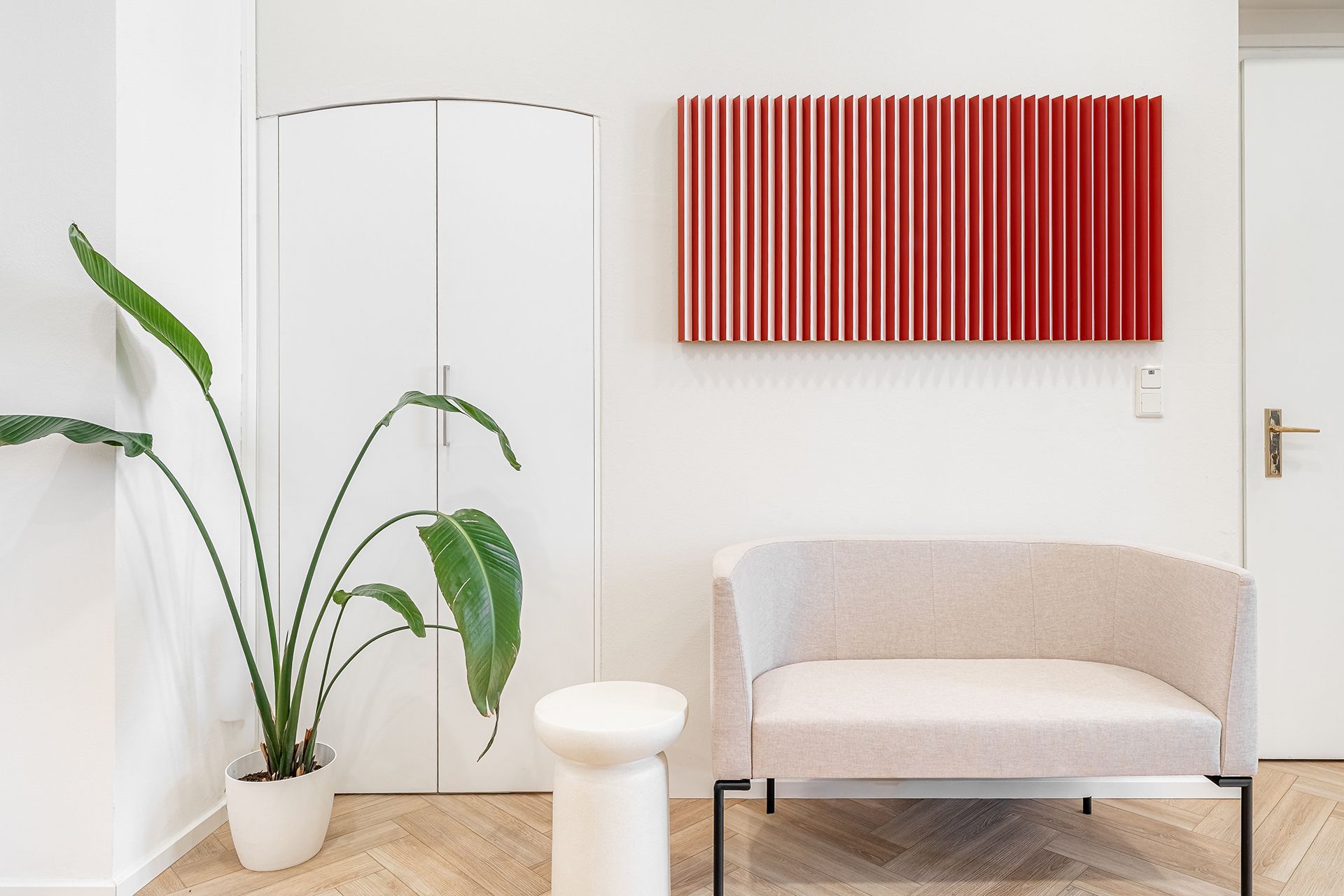
The visual principle gradually extended into the firm's interior as well. Already in the first office, a spatial element was created echoing the red-line motif — a 3D object made of triangular wooden beams: white on one side, red on the other, and striped in the middle. This simple principle symbolizes the dialogue between lawyer and client — two sides working together to find the best solution. What began as a graphic detail became a spatial element carrying the same idea as the brand as a whole.
As the firm grew, it moved into larger premises — and the 3D object moved with it, becoming not only part of the new office but also the starting point for further development of the interior. The new space was designed in collaboration with H/M studio, which developed the concept further, translated it into architectural form, and oversaw its execution. The result is an environment in which the visual identity naturally merges with the architecture and the firm's everyday operation.
Craft in the details
New Year's greeting cards for ŠTILEC & PARTNERS are produced using letterpress printing, which allows for a subtle relief and tactile experience. The minimalist design, quality paper, and precise execution reflect the same values as the identity itself — attention to detail and honest craftsmanship.
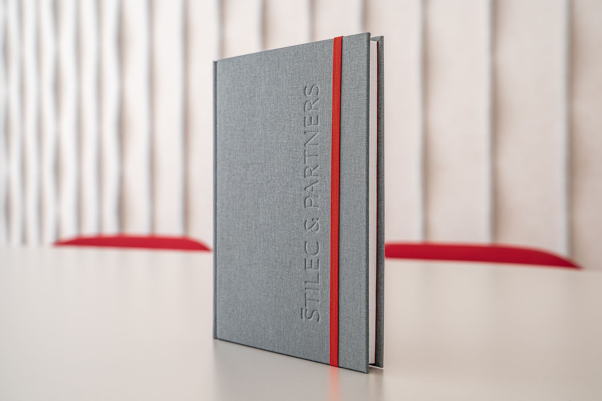
The same approach carries through to the hand-bound notebooks. The combination of quality materials, clean design, and traditional craftsmanship creates representative items that support the brand in everyday use.
New Year's cards and business cards – Ateliér Haškovec
Notebooks – Knihařství Daruma

When a visual system is carried through into physical space, a brand feels cohesive and trustworthy. Every detail contributes to an environment that naturally reflects the firm's professionalism, precision, and partnership-based approach.
Have a great project that's missing a face or a strategy? We're here for you.
More Projects